Designing a General Appeal Aesthetic for a Young Demographic
Often when we talk about things that look “generic” we see it as something bad. There is certainly a case for that. However, generic also has strong relations to things that are universally accepted.
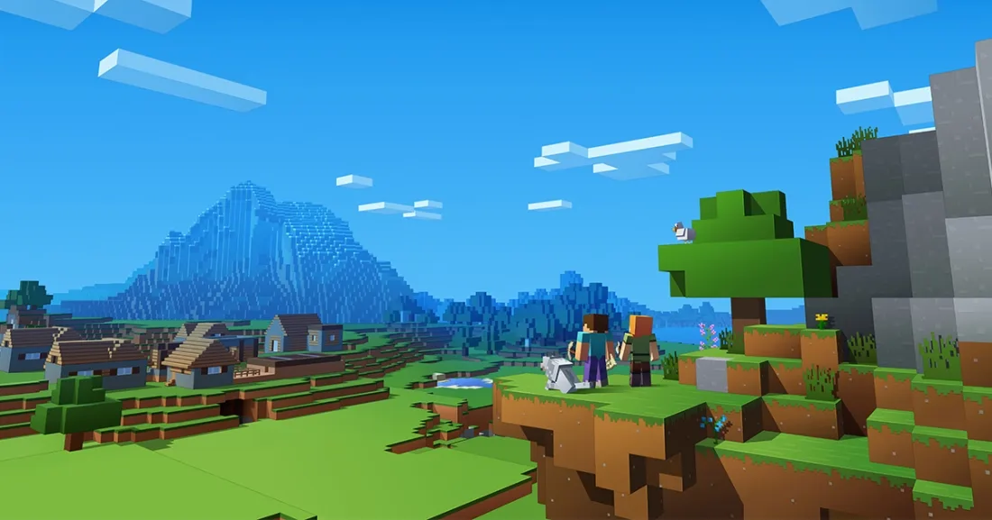
My final capstone project has progressed to the point where we needed to pin down what the specific visual aesthetic of the game. The catch is the game targets youth ages 8-12. After some discussion between us, looking at the goals of the project and what it needed to do, we decided upon a voxel art style which we would somewhat imitate within the GUI’s style.
Some Context
As stated, the project targets youths in elementary school. The purpose of the game is to be a community engagement tool for the York Regional Police. As opposed to the traditional method of having an officer walk into a school, talk at kids about bullying or other material, an officer in superhero attire (looking quite bit more like a storm-trooper) walks in with a few officers and ask if they want to play a game. It dissolves the power hierarchy as you are playing with the officers and interacting with them organically through the game rather than not.
The game itself is plays over a single wireless network. The server is held within a Virtual Reality (VR) Backpack that the superhero character wears. The unit is also tied to a Mixed Reality (MR) headset, which feeds to a spectator screen and acts as the communal screen for information. Players, the children in the schools or at events, use a mobile device on the same network to play. The game is split into a few phases. One is Augmented Reality (AR) based, and the other required players to interact with one another.
Generic is a Mislabel
Our art mentor Jonathan Standing had some great insights into this as we proposed our direction. The discussing revolved around the perception that children had about the style. Generic as a word has a bad reputation despite that is means that it is fundamentally understood by everyone. That has immense power when it comes to play in trying to make something that needs a minimal amount of friction.
Contemporary children, one’s who have been living in a much more diverse media age, are less prone to being jarred by varying aesthetics, too. To them the Minecraft-like voxel style is common place. It leverages on a nostalgia they have to know they even have.
Style Isn’t King
If Minecraft has demonstrated anything in the last years it’s that Style isn’t King. Games in similar vein that have done immensely well for themselves include Unturned and Roblox. None of these games have what any professional game developer would call aesthetic polish. The games themselves simply rely on an extremely powerful motivator, autonomy, to engage their audiences.
Voxels as an Anti-Aesthetic
Voxels in lower fidelity are generic in that it is extremely difficult to make something have a distinct appearance when working in such a limited space. Therefore, the look itself is something of an anti-aesthetic, where the aesthetic is having none.
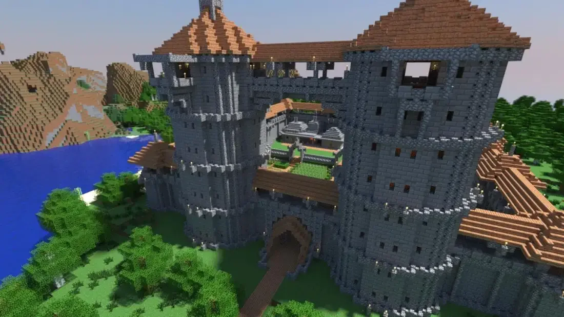
In higher fidelity it is possible to achieve something that looks distinct in it’s own right with distinguishable styles. Much of the same occurred in the early days of games when most sprites where constrained to 16×16 pixels. As time went on and larger sprites became feasible, then common place, we saw style branch out in a plethora directions.
Familiarity for Acceptance’s Sake
Despite the style being an anti-aesthetic, we are not choosing based on trying to make commentary about how we should care less about the visual fidelity of ours games. Rather, we are aiming to leverage the familiarity for the purpose of immediate acceptance.
Moreover, this is a practical scenario where we know we can’t really sink much time or effort in order to be able to deliver a compelling experience and therefore need a style we can rapidly iterate with.
Our Approach
Our game will use voxels for our character models along with a blocky pseudo-pixel aesthetic for our GUIs. I’ll break things down into more details below.
Graphical User Interface
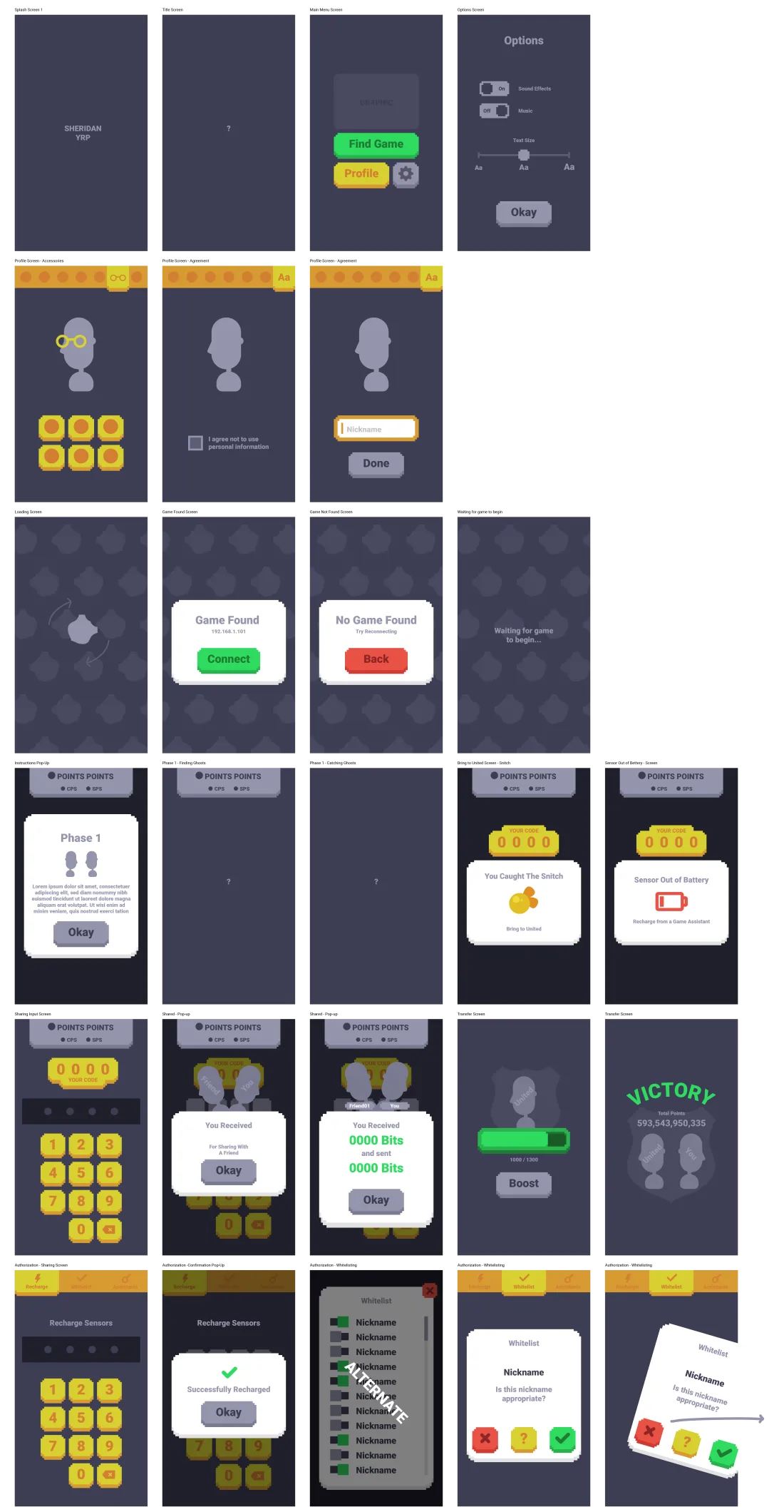
One of goals of ours was to ensure that the GUI matches what players will be seeing in AR space. Thus, the few-tone graphics blend well between the two as it has the chunkiness of voxels with the shading we get in lit environments.
Character Aesthetic
Above is a sample .VOX file that comes with MagicaVoxel, a free voxel editing program, that has been imported into Unity using a custom import tool I wrote. Our characters will very much differ from this. However, the thing we are doing that will somewhat differentiate us from others is that our voxels are all individually present. This allows use to do neat things like squish in the scale the voxel units so they leave gaps, allowing you to see “inside” the model. Moreover, we’re looking to do some really neat tricks by iterating over each voxel as you collect the entity.
As for our characters, we’ve only begun designing them this week. As we left off this Friday, we’ve decided that our direction for this will likely be (1) taking a simple geometric shape and (2) adding tentacles to it. Since our entities have to float in AR space, this will give it a sense floatiness like a jellyfish.
Conclusion
If you take anything away from this, let it be that the next time you’re developing a style, make sure that it fits your audience, even if it means “sacrificing” fidelity. There’s a lot of value in what is generic.